 25
May
Maxwell Ajagwaigbo speaks on Signs for Drug Store
- Posted by Jude Oguta
- 0 Comment(s)
Today’s pharmacy can offer much more than simply a place to fill a prescription says Chief Maxwell Ajagwaigbo the CEO of Maxceuticals Ltd. Pharmacy trends are leaning towards an all-encompassing health and wellness center where weekend athletes can get the latest in performance-enhancing protein powders, new parents can safely inquire about OTC remedies for colic or teething, and curious consumers can find out about holistic methods of care.
Maxwell Ajagwaigbo went further to say that The right signage can help you provide the necessary directions and information for each of these (and other!) customers and support you in making a positive first impression for your independent pharmacy.
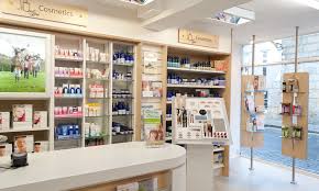
The purpose of your signage is multi-faceted. In addition to drawing attention to the merchandise departments in the front-end of your pharmacy, your signage should allow your customers to seamlessly navigate your space and should cohesively represent your brand.
Signage to Help Your Customers Navigate Your Space
Given the broad range of goods and services that your independent pharmacy may offer, steering customers in the right direction once they come through your front door is important. You want them to know right where everything is and not feel lost or confused.
A mom with a sick child has her hands full and plenty on her mind already without having to hunt down where to find the pharmacist to fill her prescription. A senior citizen recovering from hip replacement surgery has a hard enough time being mobile with their walker without having to log major mileage trying to find the pain reliever section in your store. When your customers need to get in and get out efficiently, the right departmental signage is vital.
Get to the Point
Of course, even as your personality is displayed through the use of unified colors, materials, and fonts in your signage, you want to make sure your signs are clear and concise. Don’t overcrowd your signs with detail, but don’t be too vague, either.
Remember, your customer needs to get in and get out without having to search for an ace bandage or cold-pack. Keep your easy-to-read signage in clear view overhead (but not too high up) to clearly indicate where to find the pharmacy counter or the Aleve.
Although fancy fonts may be the trend, keep your lettering simple and large enough to easily read. Help your customers quickly see what is contained within each aisle, what departments you have within your retail space, where the consultation area is, where the restrooms are, and especially where to find the pharmacist.

